When the placeholder attribute made its way into HTML5 and usage of it became commonplace and fully supported by web browsers, a bad trend started—using them in place of labels in web forms.
The temptation for designers to do this is understandable. In the process of laying out a design, keeping a UI as simple and clean as possible is usually the goal. Having just the form inputs, aligned in a pleasant grid, at first seems perfectly minimalist, removing those extraneous labels above the inputs. And with screen sizes shrinking to phone size, and complaints about “the fold”, make more elements visible within the available vertical screen space seems like another benefit.
Why Input Placeholders Fail as a Replacement for Labels
If you aren’t familiar with these terms and how they operate, here’s a quick overview. A placeholder is text that appears inside of a form field, before it is filled out. Often this text is a lighter color or opacity, to differentiate it from text that has been typed in. How the major web browsers currently handle this is when the cursor has focus in the field, the placeholder will still show. When anything is typed, the placeholder disappears. If the form field is cleared, the placeholder reappears.
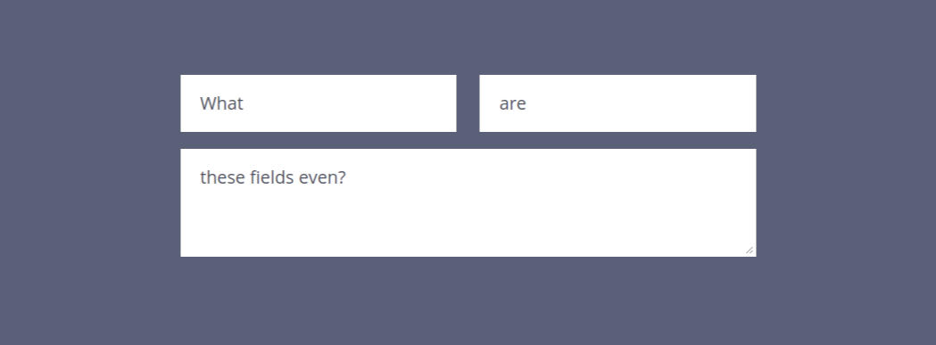
See the Pen Placeholders Are Not Labels by Josh Winn (@forthewinn) on CodePen.
Forms with Pre-Filled Values Are Often Ambiguous
An online form does not always start in an empty state. Sometimes a form may have values pre-filled, either from what was entered previously, existing account data, or some other calculation. Web browsers may also prompt to use remembered input (autocomplete). When the form starts with a value, there’s no way to know what it’s for except by guessing or deleting the contents of the field.
This is huge.
For example, clear out the second field in the CodePen above. How would the user know that the field was actually “Favorite Food”, without deleting the value entirely?
We’re not always in control of what the browser is doing with autocomplete, and it shouldn’t be necessary to disable autocomplete entirely because it’s a useful feature to help people fill out forms quicker. I’ve often seen Chrome’s autocomplete fill out the wrong fields, which can then cause a confusing validation error or the wrong info to be submitted.
They Rely on the User’s Short-Term Memory to Know What the Field is For
The longer the form, the worse this problem becomes. Using a placeholder in place of a label is relying on a very shaky set of assumptions about how the user is filling out the form, and its contents.
What if they are interrupted while starting to type, perhaps being taken away from their keyboard or device. Let’s say that only a single letter or number was filled in. How is it possible to know for sure what that field is without a label? The only way is to delete what’s there, which is unintuitive and awkward.
Losing the related context of what’s being typed in is also not a pleasant experience when it happens. This related UX deficiency is a more subtle one. It’s something that is felt, as you are typing and your reference point disappears, and you know your memory has to kick in. For a simple field like “First Name”, this may not be noticeable. But what if the field is for a longer, more complex question that is longer than one sentence?
Even if the form was initially designed with a few very short labels, the web developer / designer cannot assume that more fields will not be added. Especially when it’s in the hands of the client. There are also accessibility concerns for people who cannot fill out the form fields as quickly and easily. Not all screen-readers will read the placeholder.
Visually Reviewing the Accuracy of your Form is Not Possible
Imagine you are taking an important test at school, and just finished filling out the last question. You’re a little unsure about whether you answered them all correctly, and want to check things over before handing in the test. When look to the top of your paper, all the questions have suddenly disappeared! Only your answers are visible.
This is what input placeholders in place of labels are like. Online forms are often collecting important information, so creating a situation where the user is more likely to enter wrong information or have hesitation about submitting the form is not helpful.
The Placeholder Can Cut Off If It’s Too Long
If the placeholder is too long, this text will cut off on the right side of the text input. When a text field is 100% width and being viewed on a mobile device, there are only so many characters than can be displayed.
Some Users May Skip the Form Field, Not Realizing It is Empty
This one is somewhat design dependent. Even with the best design, some users can miss fields or not immediately grasp that the element is an empty field that needs to be filled out.
Some Old Web Browsers Don’t Show Them
This is less of an issue than it used to be, due to old browsers falling away with time. And because if you really need to support IE8 and IE9, there are polyfills available that add missing functionality. Usage of Internet Explorer is currently at around 0.2%. While many design agencies have dropped official support for it when it comes to a site looking exactly the same as the design, ideally forms should still be functioning and usable. With no label at all, this isn’t the case, unless you use a polyfill.
Is it Ever Okay? What are the Alternatives?
Generally, this technique is still being used for forms that only have one field, such as a search, or a newsletter signup. This can be okay, especially if there is additional context, such as a relevant icon or descriptive text beside it. If there’s no additional context besides the placeholder (and maybe a submit button), this is still not ideal considering all of the issues discussed earlier.
A Regular Old Static <label> Above the Field
These are fine. Web users get it. Nothing moves around on them when they focus in the field.
An Always Floating Label
The always floating label style would still look similar in the markup, but appears on top of it. This has some benefits, as well as some caveats. The text size is usually quite small, and therefore harder to read. Depending on how the styling is done, the label could also cut off if it’s too long. That’s not always the case if this situation is planned for. A wrapper element could be used for the border.
Beware the Placeholder to Floating Label Pattern
This is a placeholder that turns into a label that floats at the top of the input area when the field gains focus. It’s often animated to shrink down as it moves, which is part of its appeal. This is becoming more prevalent on the web. With Google adopting it on many of their designs, it’s being given a lot of exposure on a daily basis.
But this pattern is not the magic bullet. It is not without its many problems, including some with the initial placeholder that I’ve already discussed. Even Google’s new Material design inputs, that have a single underline and a placeholder, have the problem that user’s don’t realize this is a field; it looks like a heading.
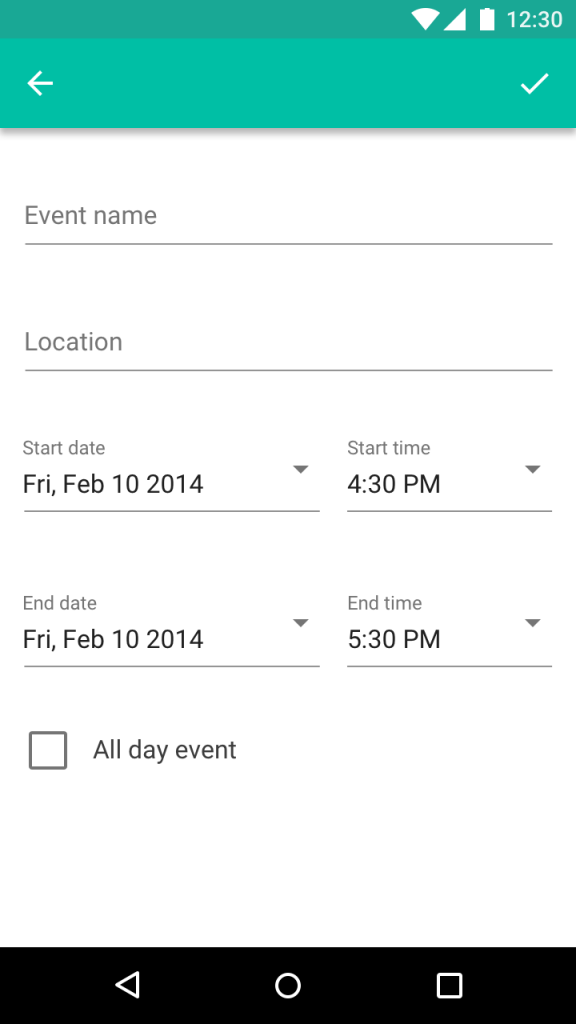
Can you tell that “Location” is an input field? Looks like a heading to me.
Adam Silver has a Medium post listing the many drawbacks of this approach, titled Floating Labels are a Bad Idea. He makes an excellent point:
Forms are not a source of entertainment. The floating label won’t make users enjoy using forms. Users don’t care. They just want the outcome.
Since the floating label doesn’t save any vertical space, and other types of fields such as radio buttons and the select element need a label anyway, why not just show the label in the first place?
In Conclusion
The good news is that the original placeholder trend is on its way out. The bad news is that the placeholder morphing to floating placeholder, while arguably better, still has usability flaws and its usage on new sites is in full-swing.
I’m guilty of using them myself, and have recently updated this site to have the labels always visible. Otherwise posting this would have been hypocritical. Being aware of these issues, let us developers and designers push back for the sake of better usability when we see this on a new site design. And call it out when we see it on existing sites that we work on.
From the HTML5 Specs:
The
placeholderattribute represents a short hint (a word or short phrase) intended to aid the user with data entry.The
placeholderattribute should not be used as an alternative to alabel.
More Reading:
![CSS Secrets [Book Cover]](/wp-content/uploads/2020/03/css_secrets_book_cover.jpg)
![Eloquent JavaScript [Book Cover]](/wp-content/uploads/2020/03/eloquent_javascript_book_cover_b.jpg)
![The Phoenix Project [Book Cover]](/wp-content/uploads/2020/03/phoenix_project_book_cover.jpg)
Nice article, I had never thought they were an issue but I will give it more thought in the future.
Your argument is not strong. Placeholder is an excellent way to label an input field when space is a concern – which is often, particularly on touch screens.
When the form is small, say a newsletter sign up with just one field and submit button, it makes sense to use a placeholder. Short term memory is not a concern when the form has one or two fields.
If screen readers can’t read placeholder text, maybe the people who make screen readers should update their software to read the placeholder text as label, when there is no label.
Don’t forget that placeholder text is still accurate data that labels a form, it’s machine readable. It’s also literally inside the form field in question. Which is a more logical location than labels which are located external to the form field, and run the risk of incorrect association.
Placeholder labels are a good thing.
I mentioned that a single field like a newsletter signup is usually fine. That’s a bit of a red herring. Screenreaders was a minor point, though not unimportant for those that use them.
The biggest issue with them is that you can’t tell what the field is when it has a value. Take a look at the embedded CodePen and clear the second value. The field is actually “Favorite Food”. Browser autocomplete for addresses, etc is commonly used, especially on touch screens where users want to save time in filling out a form. Once you activate the autocomplete, you can’t review the fields to see that they were filled in correctly. And often they aren’t, resulting in validation errors and a confused user who then may not complete the form; not good. I’ve seen this cause problems in a WooCommerce checkout, where the account username was wrongly being placed into an email field.
Pre-filled data can also come from any form where you’re editing any existing data. Even if there’s no existing data, and autocomplete has been completely disabled, there’s still the act of reviewing what has been entered into the form (e.g. step away from the computer for 10 mins and then come back to the form. Or there are users with memory impairments).
A label does not run the risk of incorrect association when you use the “for” attribute to specify exactly which field it’s for (or the input can even be put inside the label element). By using placeholder labels, you run the risk of incorrect association by using them in a way that the HTML5 spec specifically says NOT to use them.
I couldn’t disagree more with your comment. You’ve disregarded visually impaired users who can’t force screen reader vendors to modify their software so they can access the web. Visually impaired users are using the web right now, and shouldn’t be the victims of a debate over HTML specs and best practices.
The HTML spec that Josh cited clearly states the intention of placeholders, and it is NOT to replace labels.
If you disagree, I’d suggest you get involved with W3C and lobby for a change to the specs. Until that day comes, however, I’d strongly recommend that you do things the proper, accessible, way.