Lately I’ve learning more about web accessibility, with the goal of taking the WAS exam and becoming certified. In order to practice by looking at a real website, I decided that it was about time to take an accessibility audit of my own developer site (this one) to see what I can learn and what improvements can be made. This site as it currently exists was originally built around 2016 and is looking a little dated now, but is still holding up quite well considering that it’s about time for a redesign.
Starting with an Automated Scan for Compliance
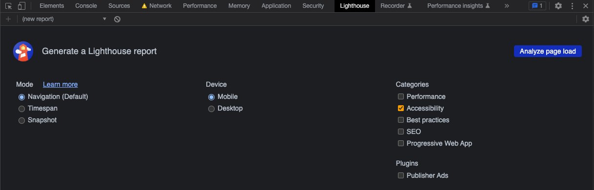
There are hundreds of automated tools out there that scan for accessibility issues. Google has one built into Chrome’s DevTools called Lighthouse. It’s also available in the Chromium-based Brave browser. It will scan a page and has options to generate reports on a few different categories, including performance, accessibility, and SEO. If you don’t want to use it through DevTools, it’s also available as a Node package, to be run in the command-line or programmatically in your build processes.
For the sake of the focus of this article, I am only going to be looking at the “Accessibility” category.
Fixing and Improving Those A11y Issues
The first scan was much better than I was expecting. On the homepage it scored a 90 out of a 100. A few of the subpages got a slightly lower score:
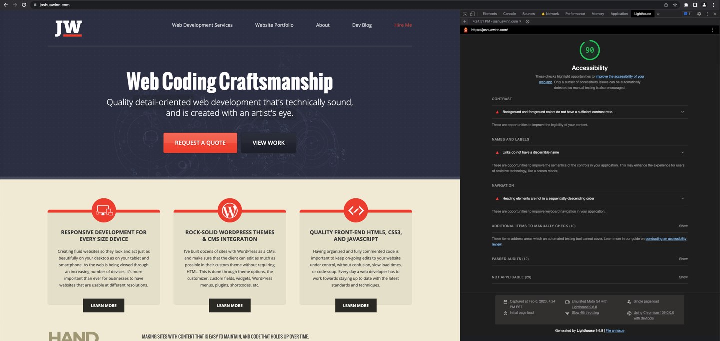
At first I was pleasantly surprised by the score. I think it is a bit deceptive, because even with a number in the 90s, some of the issues found (and those only found through manual testing—more on that later) will cause some serious hindrances to some visitors. Let’s drill into the items that it found and figure out how to fix them, and hopefully get that score up to 100.
Issues: Contrast Ratio
Background and foreground colors do not have a sufficient contrast ratio.
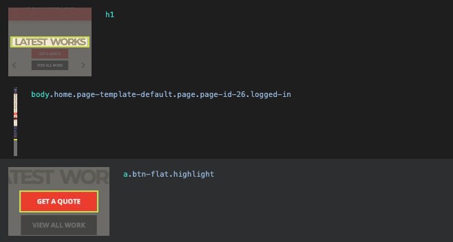
There were a around a dozen of these type of failed elements on the home page. The above screenshot shows an example of two of them. The main culprit was the dark tan on top of the light tan color that is used throughout the site. And the overly subtle font color used in the footer.
At first glance, the red button seemed odd to me, as that white on red looks like a high contrast ratio. But the ratio of foreground to background is actually only 3.7 to 1.
Using a web-based tool like a11y.com’s Color-pair Contrast Testing, we can test out the contrast ratio:
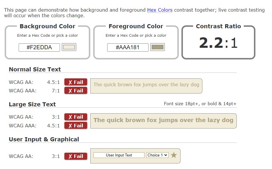
The meet the WCAG level AA, a ratio of 4.5 to 1 is required for normal sized text. Using this tool we can choose a new foreground color that meets that. I found that meeting the contrast ratio of 7 to 1 for WCAG level AAA is quite difficult and can totally change your designed colors. While you should aim towards AAA, it is not always required or recommended as a general policy for entire sites. Lighthouse uses WCAG 2.1 Level AA requirements. It covers many, but not all of them.
Only after fixing all of these related issues did the Lighthouse score go up (by four points).
Issues: Names and Labels
Links do not have a discernible name.
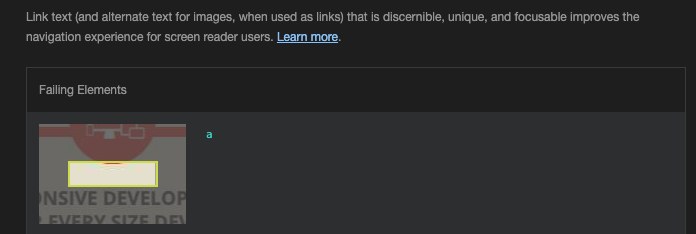
This one is caused by the round circular graphic that is linked, but the <a> tag has no readable text inside it. The graphic itself is defined by CSS and background images. Essentially, it’s like there is an image without alt text, and a screen reader would have no idea what this link is. The solution for this sort of issue really depends on the exact situation. Sometimes it may be best to have screen reader only text (hidden from display in a specific way), or to define the graphic with an img tag instead.
In this case, the text is already defined below by a heading. Initially my thought was to use the aria-labelledby attribute to reference the other element on the page that defines its accessible name. This fixes it in the scan, but when testing this with a screen reader, it reads the heading out loud twice in a row, which isn’t a great experience. Instead I opted to treat this area just like an image and give it screen reader only text. I added another span with a .sr-only utility class and text describing the graphic that is used there (“WordPress”, “Desktop, Tablet, and Phone”, and “Code”).
Form elements do not have associated labels.
Some elements have a
[tabindex]value greater than 0
A scan of one of the blog posts found this in the form to submit a comment, that is a part of WordPress. The comments.php file had been overridden for this theme. Adding the for="id-of-input" to the <label> elements fixed that. The defined tabindex attribute there was unnecessary and could be removed.
Issues: Navigation
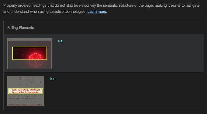
Heading elements are not in a sequentially-descending order.
Having the headings on the page structured hierarchically to represent your content meaningfully is important for assistive technologies. They should represent the structure of the page. Those using screen readers can navigate through your content using headings. To see how your page looks in this regard, one way is to look and read through it with CSS disabled.
Another is to look at the accessibility tree. This is created from the DOM tree by the browser, so that it can provide only the page info that is relevant to assistive technologies like screen readers. In DevTools, you can view this tree under the Elements->Accessibility tab (to the right of the Styles tab). Checking the option “Enable full-page accessibility tree”, will make it much easier to look through the tree within the main Elements DOM window.
This Lighthouse error was triggered by the rule “Heading levels should only increase by one“. There was an H3 within a section header, with additional H3s being used for the blog post titles. I changed the blog post titles to H4s, and adjusted some of the other heading numbers throughout the site to better reflect the contents of the page. I can see that there are additional improvements that could be made to semantics and hierarchy here.
Testing Beyond Lighthouse
After those fixes, and a few more on other subpages, we’ve now got the lovely green 100 score:
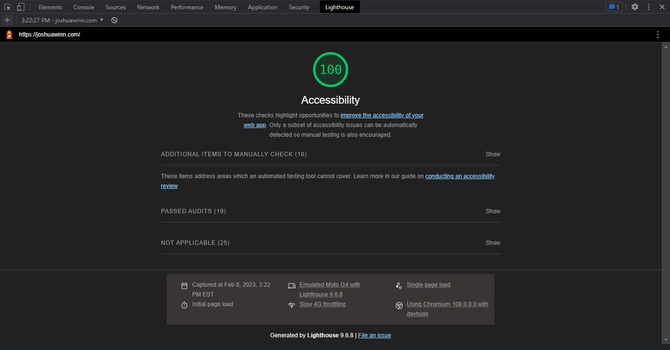
As noted in Lighthouse itself, “Only a subset of accessibility issues can be automatically detected so manual testing is also encouraged.”
And as you might have noticed in the screenshot above, it provides a list of 10 items to manually check. Many of these things can be even more important than what is uncovered by automated testing, as they involve the stumbles encountered when trying to navigate and interact with the content.
Keyboard Navigation and Tabbing Through Interactive Elements
Some users navigate a site using a keyboard only, and one way to start testing this is to make sure you can tab through interactive elements and that it’s visually obvious what has been focused. I noticed quite a few elements that did not have a focus style when focused, such as the logo at the top of the page, and the Recommended Books section of the blog.
Sometimes you’ll be tabbing through and suddenly notice the focus seems to have disappeared, which could be relating to styling or it can be a visually hidden link that needs to be addressed.
A few elements had styles but I improved the look and readability of the focus outline. This is another area where you can have visual consistency and have clear focus styles that go with your design. The outline property works really well here. You can also use outline-offset with a positive or negative pixel value, to make the outline look better around certain elements. Here’s an example of some of that CSS:
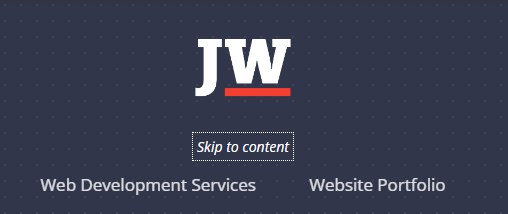
My theme has a screen reader accessible “Skip to Content” link near the top, which is a good idea to include. I found that mine was lacking an important recommended feature. When the link received focus, there was nothing focused visually. To fix this, the skip to content text will now appear when it is focused:
The bigger interactive element in question was the main menu.
Main Menu Problems
The main menu that opens at tablet and mobile screen sizes using the hamburger menu was originally created with a neat CSS-only technique (no JS! it used the :target selector to show the menu when the anchor was present in the URL). Unfortunately there were a few issues with keyboard navigation and with the state of the menu being properly understood and represented with markup.
- Focus issues
After opening the menu (Enter) and then cycling through the main menu links (Tab), after the last link, the focus moved to the main content behind the menu. You couldn’t see where focus was for the first few links because the menu was overlaid on top of it. And the menu stayed open without a way to close it. I’ve added some additional JavaScript that moves focus when you press tab on the last item, or shift-tab (previous) on the first item, so that focus cycles within the menu plus the close button. - No aria-expanded attribute
WAI-ARIA attributes were missing that say whether the menu is expanded or collapsed. I’ve added JavaScript that toggles this attribute to true or false when the open or close button is used. - Open and close buttons need more semantic markup
The open and close menu buttons needed some improved markup, to connect them semantically to the menu. I replaced separate links with a single button element which is more appropriate for its usage. The button contains different text labels inside that show or hide depending on the state of the menu. - The menu cannot be closed using the Escape key
This is a nice added feature, as it is often expected for this key to have that effect. I’ve added a JavaScript listener that does this.
Fixing and designing navigation menus to be accessible could be a whole series of articles in and of itself. For more info on how to handle menus (and true menus, which are different), see Accessible Slide-Out Menus and Inclusive Components: Menus & Menu Buttons.
Testing with a Screen Reader
Using a screen reader yourself is the best way to find out where your website may be creating unclear information or presenting it in a frustrating way to the visitor. Each one works in a slightly different way. When you hear how your content is read out loud, you’ll likely find quite a few surprises and areas for improvement like I did.
One readability issue in particular that I needed to fix was related to the curly brace symbols being displayed on the main menu link items as a hover and focus effect. The screen reader says: “Visited link, Left Brace, Website Portfolio, Right Brace“, which is confusing and becomes annoying as each navigation item is listed. Those braces are used as purely presentational elements, and they should be ignored by the screen reader.
Originally these were created with the ::before and ::after pseudo elements. Today learned that there is a slash syntax for the pseudo’s content property that allows defining “alternative text for accessibility”. Unfortunately, as of writing, it is still not implemented in Firefox and Safari (Firefox bug link / Can I Use details). There also is a new speak: never property as part of the CSS Speech Module recommendation that does not have much support yet.
That leaves us with the current best solution, which is to get rid of the pseudo elements and replace them with real elements with a WAI-ARIA attribute. What needs to be done is refactoring the generated menu and CSS so that the curly braces are within their own span tag that can be marked with the attribute aria-hidden="true". Then the phrases “left brace” and “right brace” will not be read.
There is More to Be Done
There is much to be found in manual testing that will not come up in a scan. I think of this as sort of a first pass of accessibility improvements. Even with a fairly uncomplicated site, there are many more things that can be improved upon. If you notice anything glaring, please let me know!
Some Final Thoughts
- The importance of an accessibility audit is often overlooked with smaller websites. I think that developers should be running these as often as speed tests (if not more).
- If you want to reach some level of WCAG AAA or AA compliance, I’ve noticed that the colors and design can be greatly affected by contrast ratio requirements. Therefore, it’s probably a good idea to get a designer involved in the process. And as early as possible. Trying to reach that level of compliance will likely change the color palette being used, and affect how and where background colors are applied.
- I’ve noticed that I personally enjoy the increased contrast after making changes. It has made a noticeable change in readability that I was not aware of before.
- There are more speech related properties coming to CSS, but so far there is almost no browser or screen reader support for them. In a few years, we will likely start to see some of these being implemented. There are some interesting new properties there that would give more control over how things are read on web documents, including pauses, rests, and cues.
- Thinking about how your content will be read will start to change what you write. In small ways, I changed the wording of parts of this blog post content, when thinking about how certain symbols or shorthand conventions would likely not be read by a screen reader in the intended way.
Using Lighthouse on one of your web-based projects is a great way to start making improvements, and a practical way to get started with learning about Accessibility. Reaching a score of 100 is not the end, as you’ll still need to do manual testing. Much like it is with the visuals or the code, there are almost always additional improvements that can be made.
![CSS Secrets [Book Cover]](/wp-content/uploads/2020/03/css_secrets_book_cover.jpg)
![Eloquent JavaScript [Book Cover]](/wp-content/uploads/2020/03/eloquent_javascript_book_cover_b.jpg)
![The Phoenix Project [Book Cover]](/wp-content/uploads/2020/03/phoenix_project_book_cover.jpg)