See the Pen Adventure Time’s BMO (Beemo) in 3D with CSS by Josh Winn (@forthewinn) on CodePen.
Oh my Glob! BMO in the Web Thingey
If you’re using a web browser that supports it, you’ll see our friend BMO above, embedded from CodePen. If not, then you’ve got to load up Chrome or FireFox or else this won’t make any sense. All the visuals, and that flippin’ third dimension are done entirely with CSS. Most of the buttons also do some mysterious things when you press them. You were going to press them anyway, I know it. And I couldn’t bum you out, dude!
The making of 3D BMO grew out of following this tutorial over at CSS Animation Rocks, where Donovan Hutchinson created an old Macintosh Plus in 3D with CSS. I wanted to better understand the CSS properties that were being used for 3D, and create something myself. And, uh, it had to be something that’s mostly square, because manually creating round things with flat squares is a real pain. More on that funky junk later.
First, if you just want the results of 3d modeling with browser tech, and don’t care how it’s done, check out tridiv.com. You can create some incredible 3D objects with CSS, and share them. I don’t even want to know what the math behind that web app looks like.
Onto some things I figured out along the way:
The Order of Transforms & preserve-3D
If your elements don’t seem to be moving in the right direction, try translating before rotating. That’s because the order in which you translate or rotate matters; you’ll get different results when using the same transform origin. Transform-origin is also an important property to understand, because it basically acts as your pivot point. So if you have an effect like a door swinging open, you can move your horizontal transform origin to 0 or 100%.
Another important thing I found out; if you have nested objects, and apply a transform, the child will disappear if you don’t have transform-style: preserve-3d set on the parent! IE10 does not support this property. There’s also a difference in the defaults for this in Chrome and Firefox. When I was close to done arranging the 3D pieces in Chrome, I loaded it up in Firefox, which only displayed a single flat div, which still could be rotated around in 3D. This was remedied by simply adding the preserve-3d to the parent .bmo element, and making sure the others use their vendor prefixes using the @include transition.
Rounded Edges? Mathematical!
“When bad things happen, I know you want to believe that they are jokes, but sometimes life is scary and dark, that is why we must find the light.” –BMO
Making the corners look rounded involved working with something that’s also sometimes scary and dark— math. I wasn’t content to make BMO square, and wanted bevel the edge, by creating additional connected “polygons” that create the illusion of roundness. In 3D modeling programs, this is easy with a simple modifier or a chamfer tool, and the geometry adjusts to connect all the points and keep it a single object.
So how the lump do I calculate where to position each face on the beveled edge, and how many degrees to rotate them? Well, it involves a little trigonometry, that I did need to brush up on, to get this perfect. Check out this CodePen for a working example where you can change the number of faces in the bevel (the level of roundness). Note that the number of child HTML elements needs to match the number of faces that you set. I made it into a SASS Mixin:
See the Pen 3D in CSS – Edge Bevel / Chamfer by Josh Winn (@forthewinn) on CodePen.
Basic Explanation
I drew something like this out on paper, in the process of solving the problem of how to bevel the edges of the BMO:
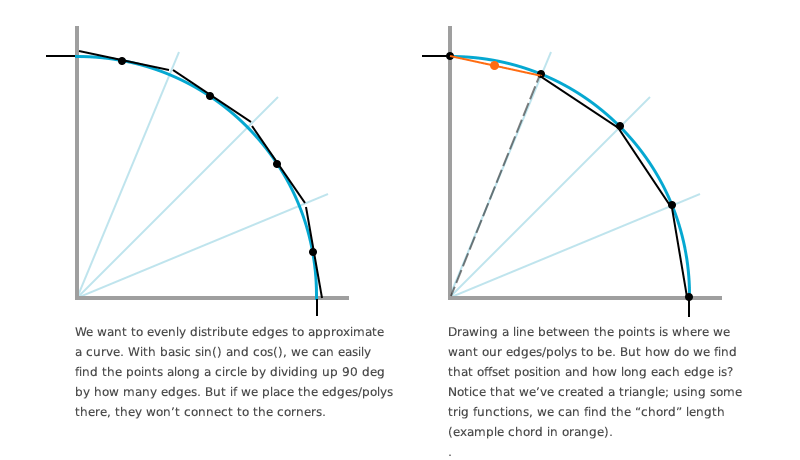
The Angle
Taking a look at the SASS mixin that rounds the edges, we first divide the total number of degrees by the number of faces passed to the mixin, to see how much each face needs to be rotated.
The mixin does a loop through each face, and finds the point on the circle—these are the black dots on the second image above. Using the previous point and the current point, and your basic midpoint-on-a-line division, we find the center of the chord—the orange point. This is the translateX and translateY offset that our face div is positioned at.
The Chord Length
A chord is a line segment whose endpoints lie on the circumference of the circle.
The length (CSS height) of each face is calculated at the start of the mixin, in $sizeCorner. Check out this little interactive circle chord calculator tool and formulas page. Or don’t. It’s a good visual look at what I’m talking about here, and is where I found the formula that we need to calculate the height:
2R*sin(C/2)
Looks scary, but it’s just: Multiple our radius by two. Then we multiply that by the sin() of the angle (our noticed triangle in image 2 of the figure above), divided by two. I’ve commented the source code pretty heavily, so please see that for more info.
Browsers Still Behaving Badly?

There are some browser hiccups and quirks that I came across when working on this. The browsers are still working out how all these things are rendered, so some of it is up in the air with bugs and weirdness. Generally, I was able to alleviate inside-out things and flickering by doing the following:
- Check the
transform-style: preserve-3dmentioned earlier. Try putting on the parent(s). After coming back to this pen after a few months, things had just stopped working in Chrome, and started showing through other elements only at certain angles. Very weird. This was the fix. I’m not sure if the CSS property defaults changed, how it handles the spec, or what. I also encountered an issue with 3D elements on the face disappearing that I fixed by putting them in a different container than some 2D elements. - Try putting
backface-visibility:hiddenon almost everything! Especially all the children of the element that’s giving you an issue, as well its parents. Firefox would not behave when everything was finished and perfect in Chrome, as seen in the screenshot above. This seems like a bug, as visible backfaces should not have caused things to start showing through each other (as if with the wrong z-index—changing z-index does not affect these things). I also encountered 3D child elements (the front buttons) flickering and disappearing when rotating.
Gaps Problem
Another issue I was having was gaps between the rendered elements. I thought of a few possible reasons why this could be happening. One, the browser rendering. It isn’t exactly a dedicated 3D engine here, and a lot of these properties are still in development. It could also be an error in my math; very likely. Or, a floating point precision problem with the math being done with SCSS could be the culprit. To fill in the gaps, in several instances I just increased the size of some of the elements by a very small amount. Anyone have any clues about this one?
The Fun Extras
All of the fun bits when you press the buttons were done with some extra JavaScript and some simple CSS animations. The eyes blinking use the step-end transition timing function, so there is no transition between the circle and square eyes (instant change).
Yes, I kinda cheated on the arms the legs—I had to finally finish this thing. Let’s just call them low-poly.
Slamacow!
THE END.
More Resources and Links
- How Nesting 3D Transformed Elements Works
- 3D CSS Macintosh Plus CodePen
- Adventure Time Wiki: BMO – BMO’s button sizes and placements change drastically between episodes…
- [1] CodePen background image thanks to Tex-Tin-Star on DeviantArt
![CSS Secrets [Book Cover]](/wp-content/uploads/2020/03/css_secrets_book_cover.jpg)
![Eloquent JavaScript [Book Cover]](/wp-content/uploads/2020/03/eloquent_javascript_book_cover_b.jpg)
![The Phoenix Project [Book Cover]](/wp-content/uploads/2020/03/phoenix_project_book_cover.jpg)